My role: UX and Visual design Tools used: Figma, Photoshop
Overview
Improving clarity, accessibility, and engagement in a complex collaboration platform
Design.localis a volunteer-driven UX initiative that pairs design professionals with nonprofit organizations to solve real product challenges.
Through this program, our team partnered with Colleaga, a nonprofit building a digital network designed to connect professionals working on complex health and social innovation challenges.
The platform was preparing for a major event launch and needed a usability review to ensure the experience was clear, accessible, and aligned with its mission of collaboration.
Over a four-week design sprint, our team conducted a rapid UX audit and delivered strategic recommendations to improve onboarding, navigation, and brand clarity.
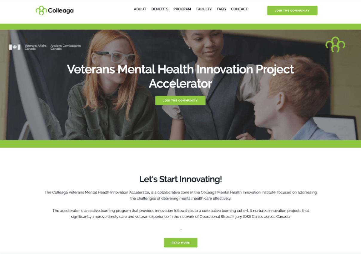
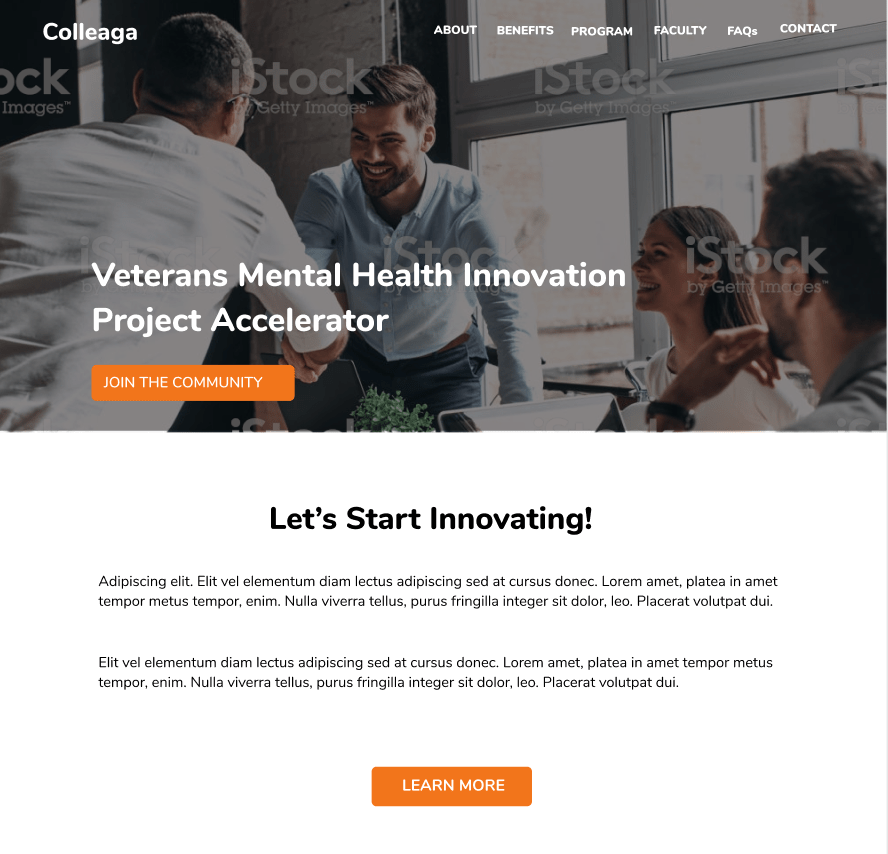
Original Colleaga Online experience prior to UX review
the challenge
Colleaga had built a promising collaboration platform, but the user experience contained friction that made the value of the network difficult to understand.
Key issues included:
• unclear personas and user motivations • fragmented system flows across multiple tools • inconsistent visual language and style guide usage • onboarding friction for new participants • accessibility gaps in color contrast and layout hierarchy
The risk was subtle but serious: if new users could not quickly understand how to participate or derive value from the network, engagement would drop during the upcoming launch.
Our objective was to identify high-impact usability improvementsthat could be implemented quickly while also establishing a longer-term UX roadmap.
My Role
UX & Visual Designer
I contributed across several areas of the project:
• conducting end-to-end UX audits • evaluating accessibility and visual hierarchy • refining style guide recommendations • identifying navigation and onboarding issues • contributing to design concepts and improvement proposals
Because the platform already existed, our role was not to redesign it from scratch but to diagnose friction points and propose pragmatic improvements.
Our Approach
We structured the sprint around a rapid UX evaluation cycle.
1. End-to-End Journey Review
The team analyzed the full user experience from signup through participation in Colleaga programs.
This allowed us to identify where users encountered confusion or unnecessary friction.
Particular focus areas included:
• onboarding and signup • navigating opportunities and programs • understanding the value of participation
2. Design System & Brand Audit
We reviewed the existing style guide and interface patterns to identify inconsistencies in:
This iterative loop helped ensure our recommendations aligned with real operational constraints.
How I Added Value
Although this was a collaborative effort, I focused on identifying usability and accessibility improvements that could be implemented quickly while supporting longer-term product strategy.
My contributions included:
Accessibility-first design review — identified color contrast issues and improved visual hierarchy to support inclusive design and WCAG alignment.
UX diagnostics across existing flows — analyzed the signup and participation journey to surface usability friction and navigation gaps.
Design system refinement — proposed updates to typography, color hierarchy, and CTA treatments to strengthen brand consistency and clarity.
Balancing quick wins with strategic thinking — helped the team distinguish between immediate interface improvements and deeper structural UX opportunities such as persona refinement and value flow mapping.
Working within an existing platform required identifying the highest-impact improvements without introducing unnecessary redesign work.
Key Findings
Three themes emerged during the UX audit.
1. Personas Needed Greater Clarity
The platform served multiple participant types — innovators, collaborators, and organizations — but the product did not clearly articulate how each group benefited from participation.
This made the value proposition ambiguous.
Refining personas around motivations and expected outcomeswould make onboarding and messaging significantly stronger.
2. Value Exchange Was Invisible
Platforms that rely on collaboration depend on clear value exchange.
Users need to quickly understand:
What do I contribute? What do I gain?
Mapping these value flows would make participation easier to understand and encourage deeper engagement.
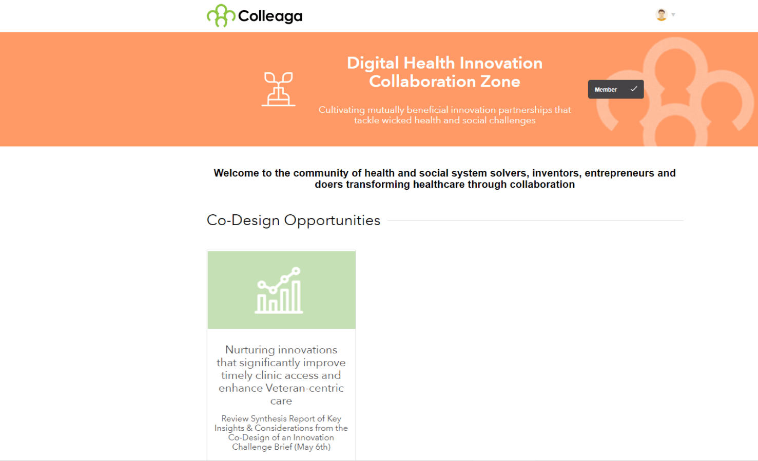
3. Fragmented System Flows
Several key user journeys required movement between different tools and systems.
This fragmentation created a disjointed experience that could disrupt user engagement.
A more unified system architecture would create a smoother participation flow.
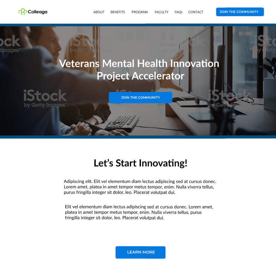
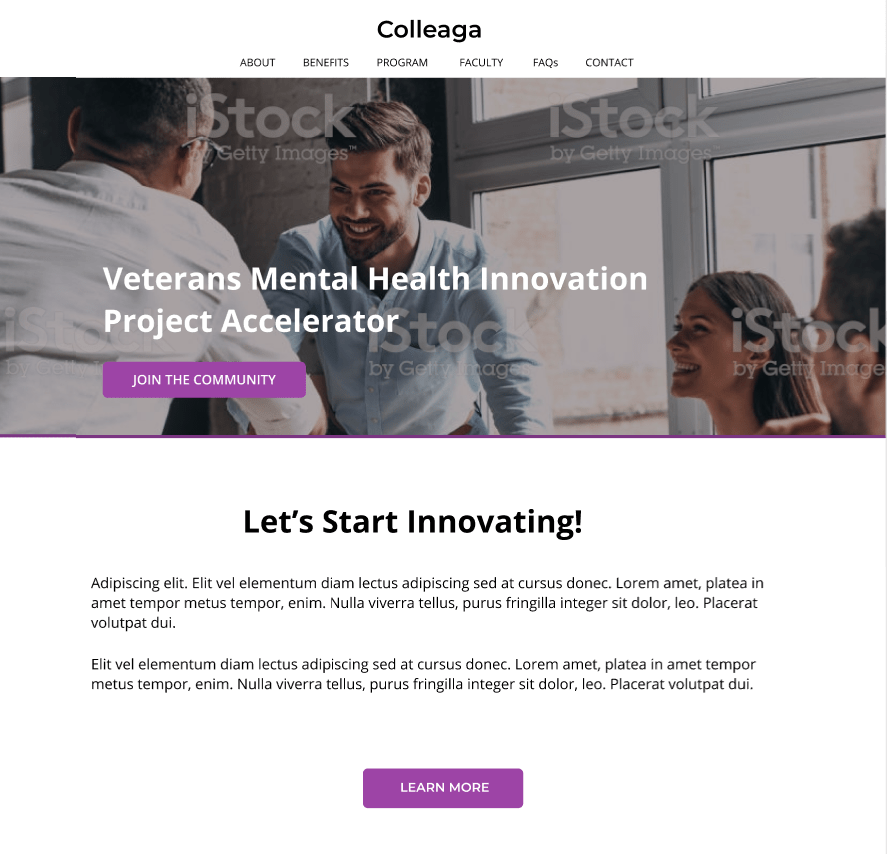
Design Improvements (Quick Wins)
We proposed several immediate improvements that could be implemented without major development effort.
Visual hierarchy improvements
• stronger CTA color contrast • simplified button treatments • reduced vertical spacing for improved scanning • clearer typography hierarchy
Accessibility improvements were especially important because the platform serves diverse communities working across health and social systems.
We proposed several immediate improvements that could be implemented without major development effort.
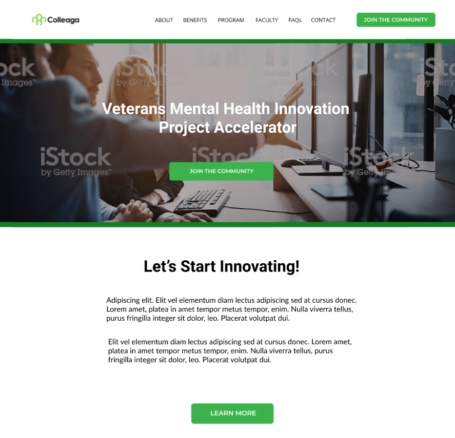
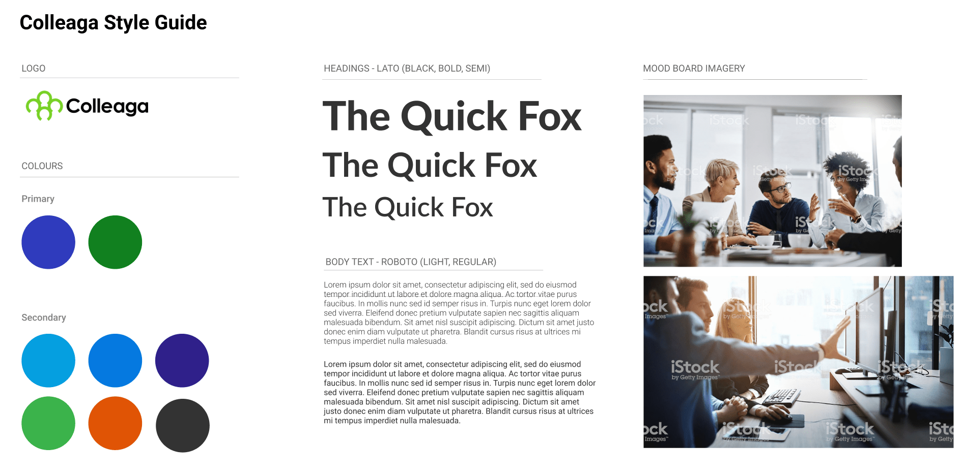
Style Guide Enhancements
We also expanded recommendations for the Colleaga style guide to improve consistency across the platform.
Key updates included:
• refined color palette for stronger visual hierarchy • improved CTA color treatment • typography refinements using Lato and Roboto • updated imagery guidelines focused on collaboration and idea sharing
These changes helped reinforce Colleaga’s brand as a collaborative and innovative network.
Strategic Recommendations
Beyond quick improvements, we delivered several larger strategic recommendations.
Persona & empathy refinement Revisit personas with deeper insight into motivations and participation goals.
Customer journey mapping Map full participation journeys for each primary persona to identify engagement opportunities.
Value-creation flows Define how value is exchanged within the network to clarify the platform’s core benefits.
System architecture review Assess how different tools interact across the ecosystem and identify opportunities to unify the experience.
Impact
Our work helped Colleaga prepare their platform for launch by delivering:
• a structured UX evaluation of the existing platform • accessibility improvements and visual hierarchy refinements • actionable design recommendations for both quick fixes and long-term strategy • expanded documentation for design system consistency • a roadmap for improving user engagement
Just as importantly, the team provided an outside perspective, helping identify narrative and usability blind spots that are often difficult for internal teams to see.
What I Learned
Working on an existing platform highlighted the importance of diagnosing experience problems within complex systems.
Instead of designing new screens, the challenge was identifying where:
• value communication breaks down • systems create unnecessary friction • design inconsistency erodes clarity
The experience reinforced a critical lesson in product design:
Sometimes the highest-impact work is not creating something new, but making an existing experience coherent.