Podium
app.
My role: UI design, sketching and prototyping
Tools used: Figma, Photoshop
the challenge
Working out is hard enough, so how do we get to the gym when we don’t feel like going in the first place? I set out to design an experience that would help motivate users and take the workout experience to the next level.
the design process
To kick off the project, I spent a few days doing some market research in order to capture as much information from the available workout apps and come up with another layer to encourage users to go exercise.
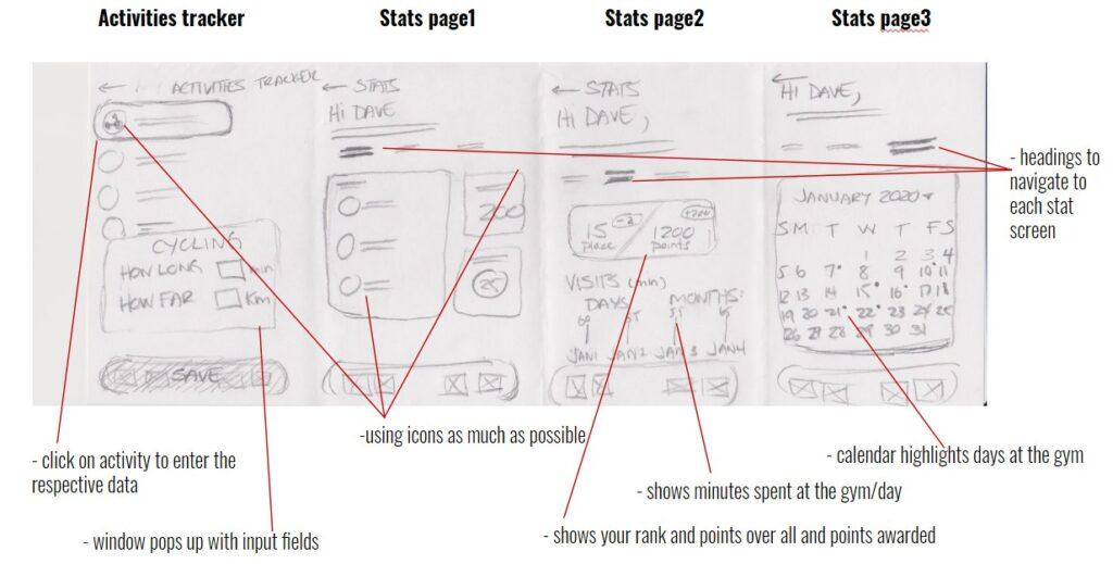
Another part of the process was to interview people who were planning to work out or who have worked out in the last 6 months. This helped me understand what was keeping users from the gym and what would encourage them to work out.
Some of the key pain points that came up were:
- Difficult to keep up motivation after missing multiple workouts
- Gyms were either expensive or intimating
- Meal prepping and tracking calories seemed like too much work
- Tracking workouts were a lot of work
From the main pain points that were mentioned above, I created multiple hypotheses in order to create an all-in-one solution that would help solve each problem. Users would be encouraged to work out if there was a product that was:
- flexible to their current lifestyles,
- inclusive to different fitness levels and equipment,
- and most importantly fun
Creating user personas and brainstorming creative solutions happened after the interviews. that would drive the ideation for the sketches, wireframes, mockups and final designs. During the process I incorporated a design/test/feedback loop in order to refine the design.
MOCKUPS
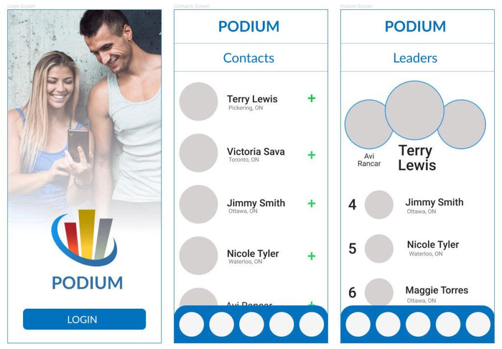
After a few rounds of ideation, I worked up to medium fidelity mockups and were starting to feel solid in our direction. There were a few rounds of A/B testing where we were able to narrow down two possible directions.
As we were going to high fidelity mockups, we learned that we needed to rework our mockups to allow for an additional option. Users needed another option beyond just inviting a friend to workout. Turns out that we could link users to social groups to increase their interest in working out.
the visual design
With the major UX defined in the form of wireframes, user flows, user personas, the visual design of the mobile app was designed along with the copy for each interface.
After the mockup phase, we recognized the adding social media groups to the design would add another level of community, so that users could join additional exercise groups (running/cycling/etc…), in order to increase their workout motivation.
We were able to incorporate this new requirement without having a drastic impact on the design. The team was pleased that we were able to incorporate this new feature into the design without having to start over from scratch and we were able to stay on schedule.
Key features of the final product
A descriptive, the dashboard is used as the home screen that shows the most important information to the users.
Key attributes include:
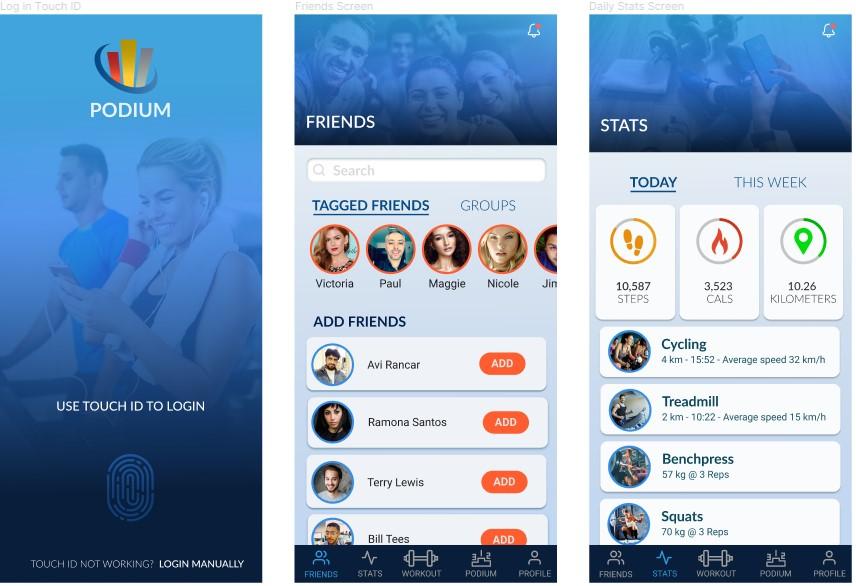
- After completing the onboarding process, the user can quickly access the app using their finger print.
- Users can determine their workout sprints (4, 6, 8 weeks) and add friends to their sprints from the contacts on their phone or via Facebook integration.
- Users can see their Stats dashboard, including their daily or weekly steps, calories burned, and total kilometers traveled via exercise.
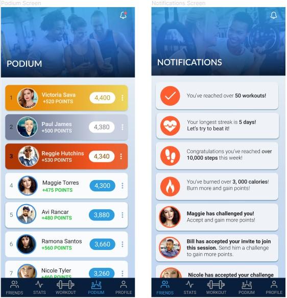
- Users can see how they stack up vs they’re friends on the Podium dashboard. Who’s going to have a gold medal finish and all the bragging rights?
- Users can see their milestones as well as challenge messages from other friends in their current sprint on the Notifications screen.
- Challenge or encourage your fellow competitors, the choice is yours.
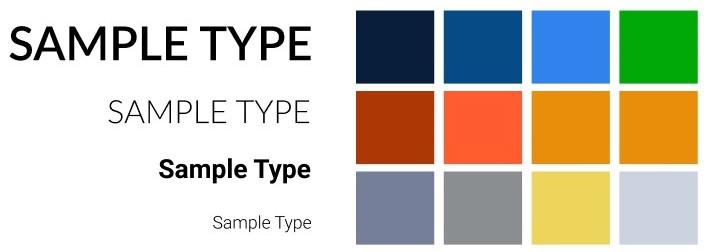
DESIGN SYSTEM - LATO TYPEFACE
product value
- To give users a new way to stay motivated with their workouts
- A resource for users to improve their fitness and lifestyle goals
- A tool to educate users on exercise and wellness regimes
- To give gyms and online communities access to a networks of health-minded people
- To give nutrition and supplement suppliers access to diet conscious people
learnings
Through research and an iterative design process, I was able to understand and identify the users’ frustrations. All and all the users needed a solution to keep their fitness aspirations on track. The key was to flush out what users’ needed to help keep them motivated, especially when their momentum ran out.
The ability to craft features of the app as per the user goals was the most important part of this design process.
I’m really happy with the way the project turned out. From researching and testing to design, everyone involved was excited throughout the process as well as to see the end result. I learned through passion, great ideas can grow.
Here are a few features to be added in a future release:
- Explore diet and meal tracking functionality
- To give nutrition and supplement suppliers access to diet-conscious people
- Introduce a sleep tracking feature.
