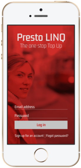
How to help transit users to top up their Presto smart cards in real-time without the need to queue up in long line-ups
DELAYED PAYMENT UPDATES ARE A REAL PROBLEM
The Presto card fare payment system gives commuters access to multiple transit lines and to pay for it all in one place. Commuters are frustrated because their Presto card top up payments could take 24-hours to register in their accounts. If the payment isn’t registered, they won’t be able to board a bus/train until that payment clears.
THE SOLUTION IS TO HAVE PAYMENT UPDATES IN THE REALTIME
After conducting user interviews and research, having an app that gives users a real time update of their Presto account would help ease frustrations.
The Presto LINQ app was created to help users:
Top up for their transit fares via credit card/Apple/Google pay on their mobile phones.
Alleviate long lineups at pay stations, especially in inclement weather and potentially missing your connecting vehicle.
USER INTERVIEWS
To better understand the perspective of the user, I interviewed 10 (ages 30-45) people who use Toronto transit and use the Presto card. I wanted to learn about their preferences, motivations, and frustrations as they related to their commute.
INTERVIEW SCRIPT:
What is your name?
What is your occupation?
Tell me about your place of residence?
Describe your neighbourhood.
Do you take the TTC? How often? Why? At what times of the day? What’s that like?
How web savvy are you? Are you comfortable using online services? Do you bank online?
How do you pay for your fares? Why? Do you use Presto? Why? What’s your experience like?
Tell me about the last time you paid for a fare/used Presto. How was that? Did you have any frustrations?
Do you wish anything could be different? Why? How?
INSIGHTS
Most commuters took public transit for work and outings after work.
Users just wanted to get to their destination without a delay impacting their busy schedules.
Presto cards made things easier, yet it was frustrating that top up payments could take up to 24 hours to register.
They all have busy lifestyles and welcomed new solutions to simplify their daily routines.
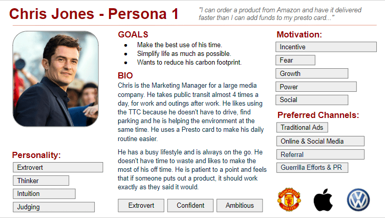
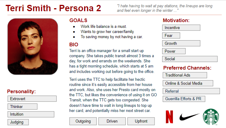
USER PERSONAS
I used all of the data I gathered during the research and interview process to create two personas. The commuters I interviewed had different needs and motivations for using public transit, therefore I wanted to capture both types of users through my personas.
INFORMATION ARCHITECTURE
A high-level list of app features was created to further define and guide the vision for the product. Prioritizing the features with supporting research created a clear order of execution.
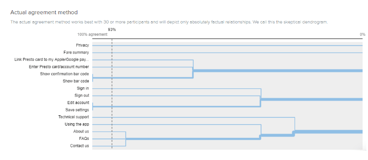
CARD SORTING VIA OPTIMALWORKSHOP.COM
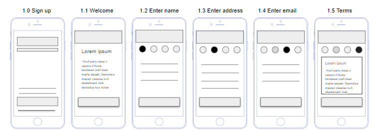
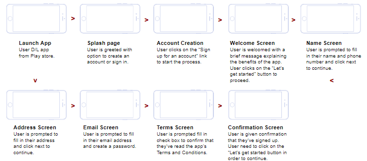
IA - CREATE AN ACCOUNT
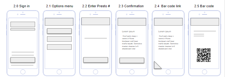
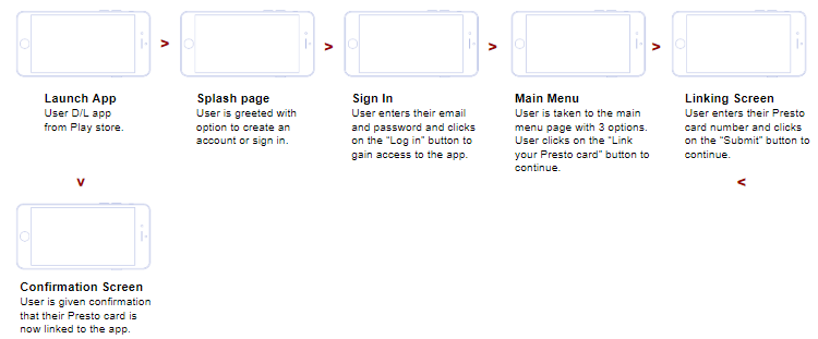
IA - LINK YOUR PRESTO CARD
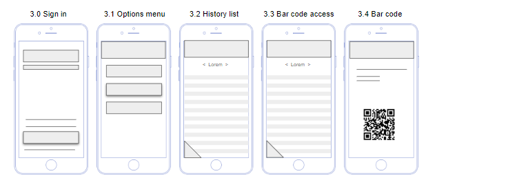
IA - FARE HISTORY LOOKUP
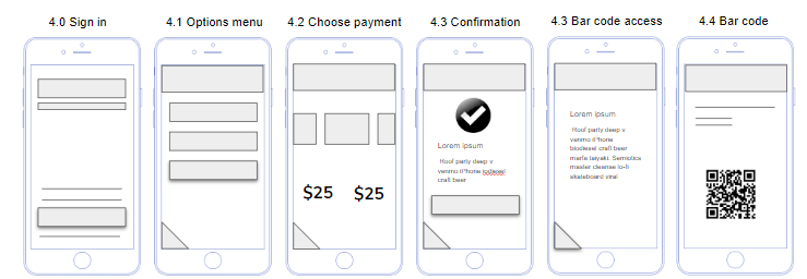
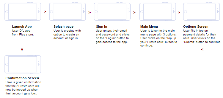
IA - TOP UP PRESTO CARD
OUTCOME
CREATING A USER ACCOUNT
LINKING USER’S PRESTO CARD TO THE APP
LOOKING UP THE USER’S FARE HISTORY
TOPPING UP THE USER’S PRESTO CARD
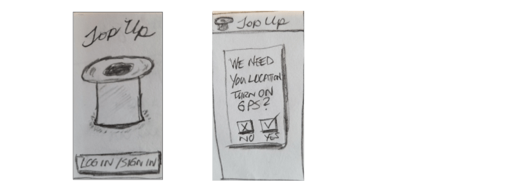
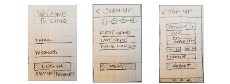
SKETCHES
I started brainstorming logos and look and feel. Coming up with brand adjectives helped me narrow my vision. I sketched different ideas first, and then created digital versions of my favorites.
INITIAL CONCEPT SKETCHES TO DEVELOP THE LOOK AND FEEL.
SECOND ROUND OF SKETCHES TO DEVELOP FUNCTIONALITY AND LAYOUT.
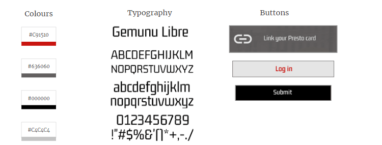
UI DESIGN
The buttons, fonts and colours were added to the Style Guide, a constantly changing document that contained the app components and UI patterns.
CLICKABLE PROTOTYPE
PLEASE VIEW THE FINAL PROTOTYPE
LEARNING OUTCOMES
Accept the fact you’re not going to nail it on the first run, it’s a design process.
Lo-fi wireframing and prototyping saves time, especially when you have more changes coming from user testing.
Receiving ongoing user feedback helped with tightening up the design.
The card sorting exercise was insightful for me to deeply understand the user, discover how they think and how they’d like their information presented to them.